Introduction
This article describes the assessment of air quality around Whitefield (Bangalore, India) for the period Aug 2018 to Dec 2019 based on the data from 13 citizen managed low cost realtime air quality monitors and one government manual monitor. For the assessment, we will be using the PM2.5 (particulate matter of size 2.5 microns or below measured in μg/m3) measurements done by 14 PM2.5 monitors at various locations around Whitefield.
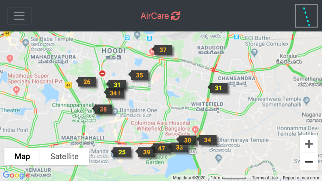
Figure 1: Air quality monitors showing current PM2.5 values @Jan-18-2020 10:30AM
For an in depth analysis, we will be using data from an AirCare monitor at Ferns Paradise and compare with the data from the AirCare monitor at Windmills.
PM2.5 are particles or droplets of size 2.5 microns or less are a major part of polluted air and is associated with various negative health effects. There is no safe limit for PM25 and the WHO guideline value is 10 µg/m3 for annual average. Long term exposure to these particles cause increased rates of heart disease, stroke, lung diseases, kidney disease, and diabetes. For 10 µg/m3 increase in PM2.5 the life expectancy reduces by one year. Exposure to 10 µg/m3 of PM2.5 is equivalent to smoking half a cigarette per day. You can read about PM2.5 and its harmful effects here.
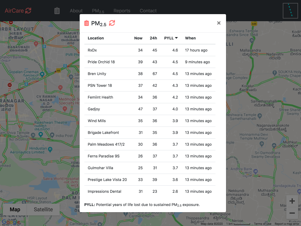
Figure 2: PM2.5, last 24 hours averages, and loss of life expectancy @ Jan-18-2020 10:30AM
Findings & Analysis
Why do we want to use the USA air quality standards in our analysis?
In the analysis described in this article, we have used the US air quality standards instead of the India air quality standards.
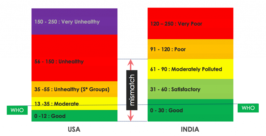
Values displayed are for PM2.5 in µg/m3
Indian air quality standards are very relaxed. For example, an 60 µg/m3 24 hour PM2.5 exposure is considered euphemistic Satisfactory, whereas as per USA standards it is considered Unhealthy!
60 µg/m3 of PM2.5 is 6x the WHO guidelines, equivalent to smoking 3 cigarettes a day, and losing of 6 years of life!
In India, the air quality is reported via air quality index that is in the range (0-500). Air quality index is more suitable to report a single index number when considering many pollutants like PM2.5, PM10, NO2, etc. All the research reports that analyze health effects are based on raw PM2.5 values averaged to 24 hours and yearly. We have used raw PM2.5 number for the analysis. The air quality assessment is based on USA air quality standards are described here.
Yearly snapshot
The following picture shows the daily air quality assessment for two Whitefield locations for everyday of the year.
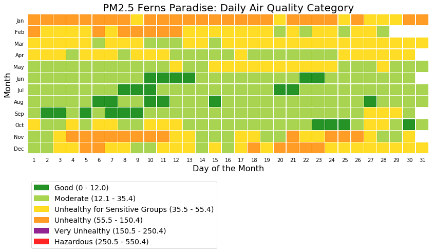
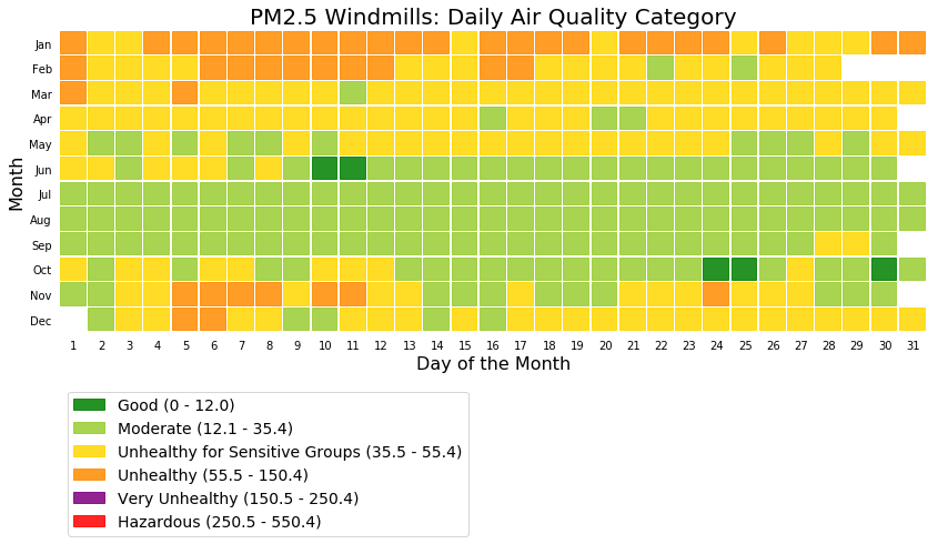
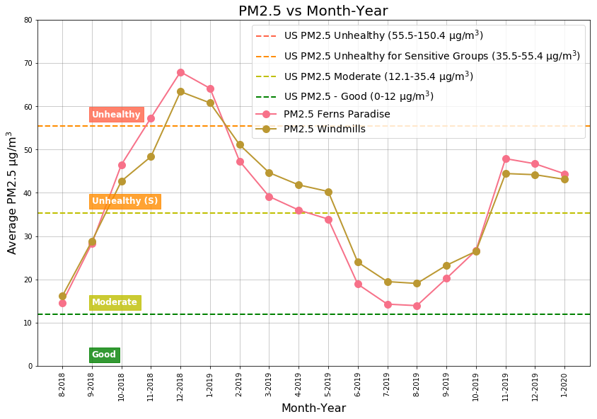
The above two figures shows that Ferns Paradise had more Good air quality days when compared to Windmills. Note the high number of Unhealthy air quality level days during the months of January and February.
Table 1: Air quality ranking and loss of life expectancy
The table below shows the best air quality rank, Aug 2018 to Dec 2019 period PM2.5 averages, and loss of life expectancy for Whitefield locations.
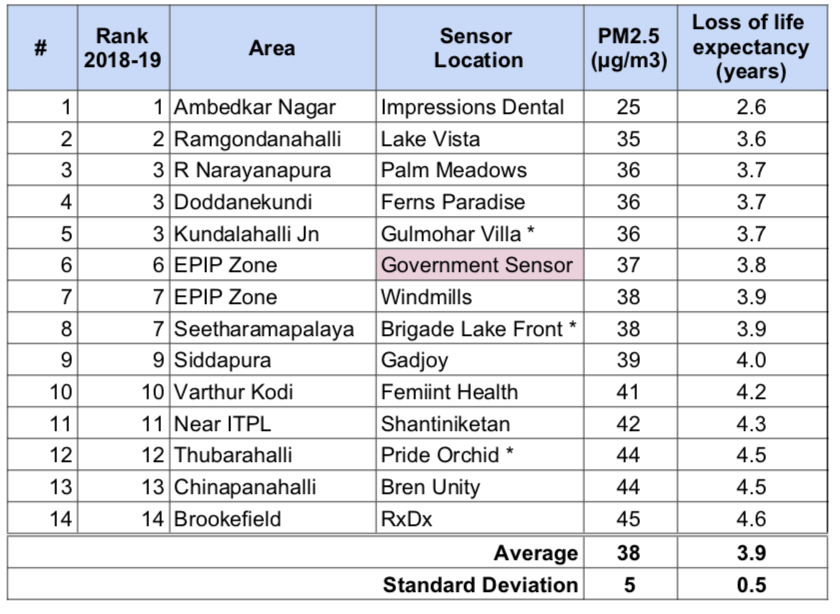
* Based on partial data
The PM2.5 levels are 3.8x times of that of WHO guidelines and fall in the Unhealthy for Sensitive Groups USA air quality assessment category, meaning that members of sensitive groups may experience health effects and the general public is not likely to be affected. The following table shows a comparison of average life expectancy lost due to various causes.
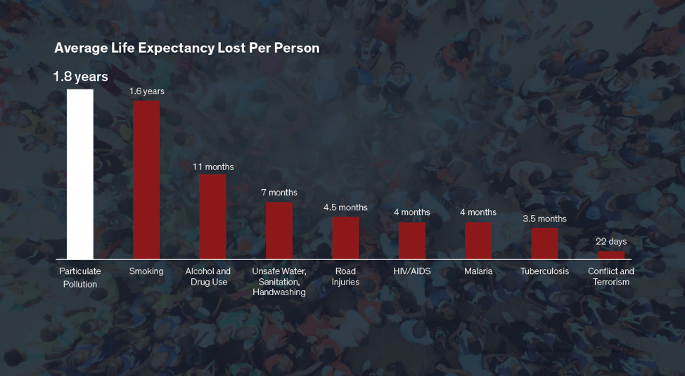
Figure 6: Life expectancy lost due to various causes
Table 2: 2018 to 2019 reduction in PM2.5 pollution
The table below shows the yearly PM2.5 pollution level changes from 2018 (Aug-Dec) to 2019 (Aug-Dec):
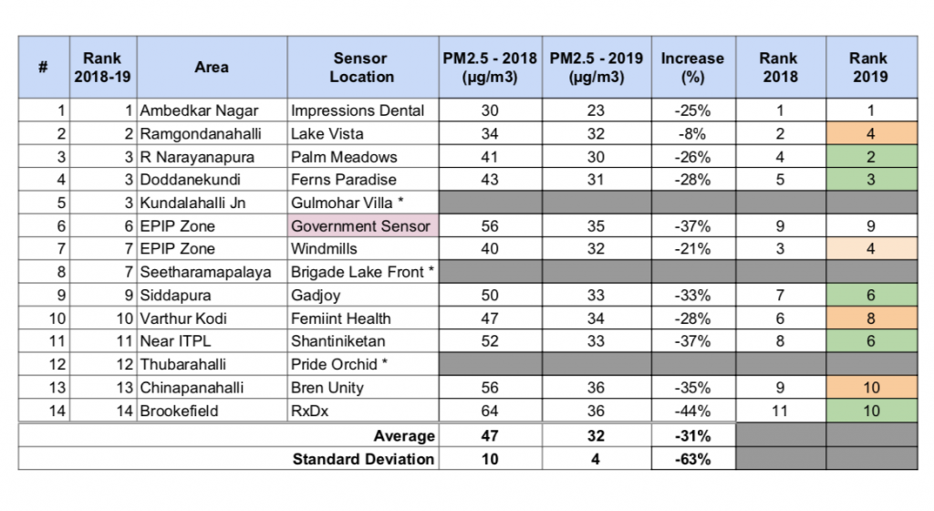
* Do not have data for the comparison
From 2018 to 2019, the air quality has improved from Unhealthy for Sensitive Groups to Moderate category. Moderate means that the air quality is acceptable; however, for some pollutants there may be a moderate health concern for a very small number of people who are unusually sensitive to air pollution. All location except Ramagondanahalli show good improvement in air quality.
The reduction in PM2.5 levels can be attributed to the following known significant factors:
- 24% increase in Wind Speed from 2018 to 2019.
- 54% increase in rain from 2018 to 2019.
- Graphite India Private Ltd factory partial shutdowns during the months of Oct-Dec 2018 and permanent closing down in Feb 2019.
There is an unquantified increase in pollution due to increased number of vehicles, open waste burning, construction, and road dust. The following chart shows the source contributions for the year 2015 and 2030 (projected) from http://www.urbanemissions.info/india-apna/bengaluru-india/.
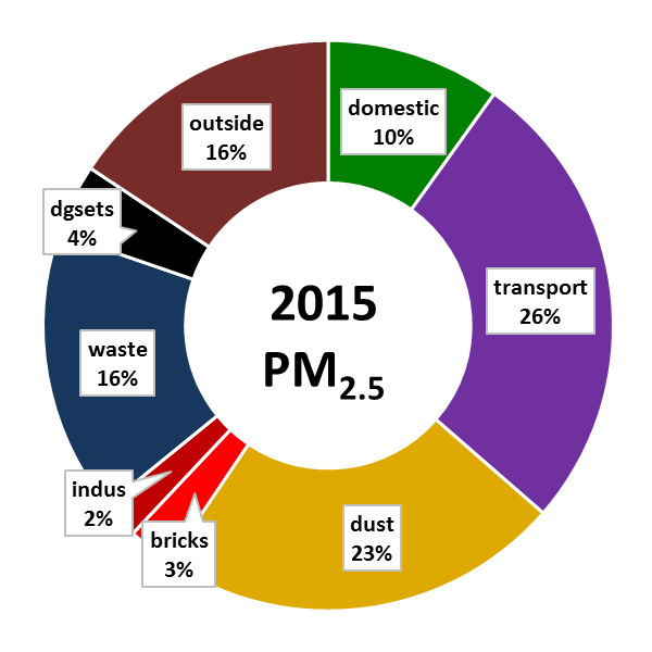
Figure 7: 2015 Sources of pollution
.
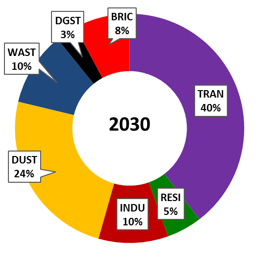
Figure 8: 2030 Projected sources of pollution
PM2.5 Monthly History
Monthly Averages
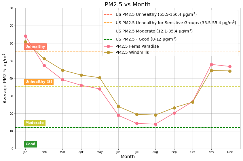
The Unhealthy (64 µg/m3) air quality level is found during January. Top three months with Unhealthy for Sensitive Groups (47 µg/m3) air quality levels are: November, December, and February. Top three months with Moderate (16 µg/m3 ) air quality levels are : June, July, and August.
During the months of June to September, the south west monsoon has a monthly average wind speed greater than 6 km/hr that effectively transports away the particulate matter reducing the pollution. During the same time, the monsoon rain also washes away the particulate matter but to a lesser extent. The monthly average wind speed (0.2 km/hr ) and the rain fall is at their lowest in January causing the particulate matter to linger close to the source.
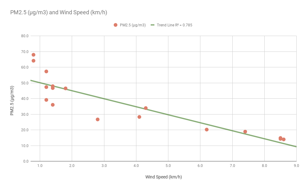
Wind speeds greater than 6 km/hr significantly reduces the PM2.5 pollution to levels below 20 µg/m3. Large number of open lands being converted buildings would reduce the wind speed and hence would increase the pollution levels.
Day of the Month
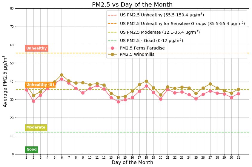
Days of the month with Unhealthy for Sensitive Groups (40 µg/m3 ) air quality levels are: 4th, 5th, and the 6th. Top three days of the month with Moderate (29 µg/m3) air quality levels are: 2nd, 14th, and the 15th.
Day of the Week
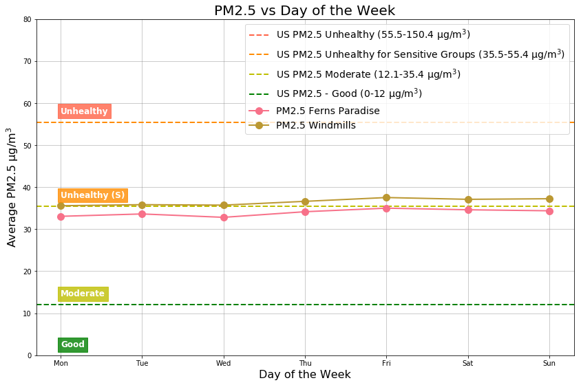
The PM2.5 pollution levels remain the same independent of the day of the week.
Hour of the Day
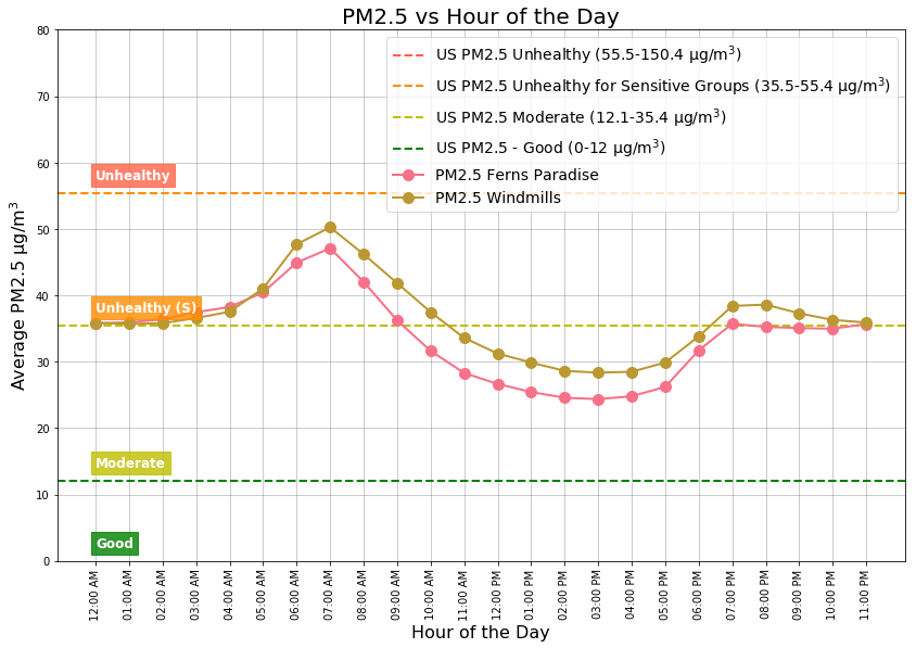
Hours of the day with Unhealthy for Sensitive Groups (45 µg/m3) air quality are: 06:00AM – 08:00AM. Hours of the day with the Moderate (25 µg/m3 ) air quality levels are: 01:00PM – 03:00PM.
The air that is closer to the earth is warmer and denser than the air above. The higher you go the air becomes colder and thinner. The air temperature decreases by ~1 degree centigrade for every 100m increase in altitude. The warmer air that closer to the ground rises transporting any particulate matter.
During the winter months (Nov, Dec, and Jan) the skies are clear, the air is calm and stable, and the nights are longer. The winter sun, low in the sky supplies less heat to the earth’s surface; this heat is quickly radiated cooling air closer to the ground. A less dense warm air moves in to create a warm air cap/lid called the Inversion Layer, as shown in Figure 15.
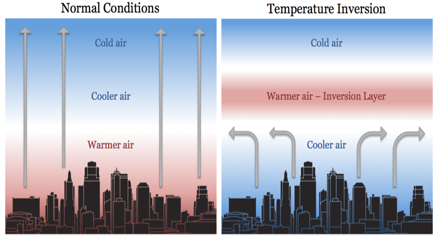
During the winter early morning hours, this inversion layer traps the pollutants along with the cooler air rich in moisture and is called the smog as shown below in Figure 16. This is the primary cause of high pollution during the winter mornings.

Once the Sun heats up the land and the air later in the day, the inversion layer is broken and the pollutants are carried away.
Recommendations
Summary
Annual PM2.5 pollution levels across Whitfield (Bangalore) is estimated to be around 38 µg/m3. This is 3.8x times of the WHO guideline of 10 µg/m3. An estimated 3.9 years of life expectancy is lost due to PM2.5 pollution; this is 2x of the years lost due to smoking!
Mother nature has helped in reducing pollution by 31% year over year through winds and extended monsoon rain. Citizens have played a role in shutting down multiple polluting industries around Whitefield.
The number vehicles, road dust, and open waste burning continue to rise unabated every year.
Citizens
Citizens should become more aware of air quality standards and apply pressure to the government to follow WHO guidelines and adopt international standards. Become aware of who can influence actions to improve air quality. Residents need to actively promote walkability in the neighborhood and public transport through increasing number of BMTC Buses, METRO, Sub-urban rail.
Citizens should eliminate their outdoor activities like walking, playing, and exercising when the air quality levels are Unhealthy for Sensitive Groups or worse: be aware of the poor air quality till 08:00AM. You can get a real time air quality for your location (or closer) at https://aircare.mapshalli.org. You can reduce the indoor air pollution level to less than 10 µg/m3 by installing and operating an indoor air purifier.
Home Owner Associations
Home owners associations should maintain their Diesel Generators and eliminate mosquito fogging as it causes significant pollution with no real benefits; instead use alternate and proven methods for mosquito control.
Government
Central Pollution Control Board (CPCB)
From a policy front, Indian government should come up a realistic air quality standards aligned with WHO standards and adopt best practices from other countries.
Karnataka State Pollution Control Board (KSPCB)
Whitefield, the technical powerhouse of India just has one manual government air quality monitor! It is high time to replace the manual government monitor installed in EPIP, Whitefield with a real time continuous monitor that provides timely information to the citizens.
BBMP, local Corporators, and the local MLA
Include improvement of air quality in your manifesto and in the ward improvement plans.
Ensure that the roads are cleared off dust and improve road infrastructure to prevent resuspension of road dust. Increase street cleaning using mechanized cleaners and manually remove dust from the roads and footpaths
Proper disposal of garbage and penalizing garbage burning will also help.
Acknowledgments
We thank various individuals and home owner associations for hosting the 12 AirCare air quality monitors and one Purpleair monitor. They also spend their energy on a continuous basis to keep the monitors up and running. Rahul Bedi provides us with critical weather data for analysis.
A list of individuals whom we want to thank are: Manoj (RxDx), Dr. Sunitha Maheshwari (RxDx), Clement Jayakumar (Ferns Paradise), Ajit Lakshmiratan, (Gulmohar), Zibi Jamal (Wind Mills), Ramakrishnan (Palm Meadows), Srinivas Ganji (Brigade Lakefrnont), Vivekanand (Gadjoy), Dr. Jagadish Prasad (Femiint Health), Mithun (PSN), Mukesh (Bren Unity), and Rahul Bedi (Pride Orchid).
Epilogue
How good are the low cost air quality monitors?
The questions people always ask are the following: how good are the low cost sensors, have they been calibrated and recalibrated, will the data be used and accepted by government including the courts?
The following figure shows correlation between the government monitor and one citizen air quality monitor.
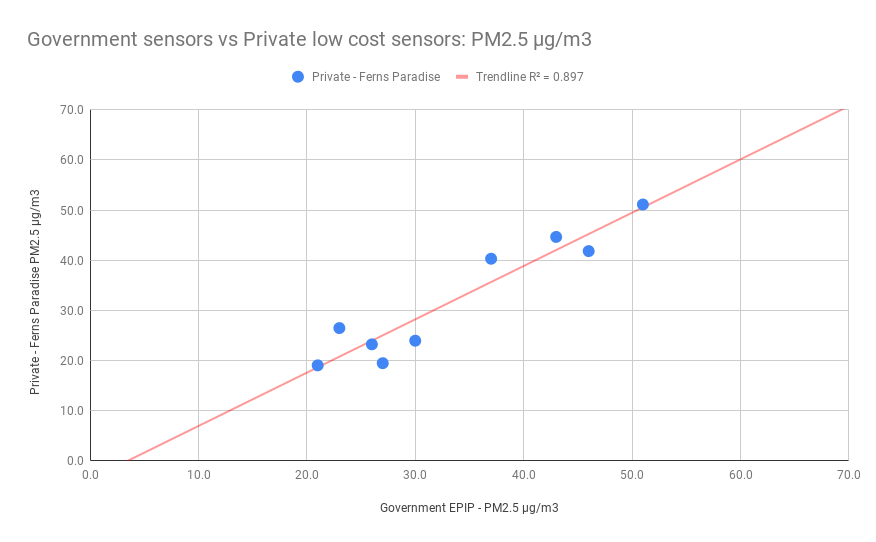
Data shown is monthly PM2.5 in µg/m3
Government including the courts will not accept data from low cost air quality monitors operated by citizens. We have shown that the data collected by large number of low cost monitors is as good as the expensive government monitors. The citizens air quality monitors provide better real time data and are able to capture the variations from location to location more effectively. We hope the data can be used in discussions to influence government to install more government real time air quality monitors.